Repaint House Paint Visualizer
- 4.4
- Rating
- 10.00K
- Installs
- Free
- Price

 Analysis by App-foxy
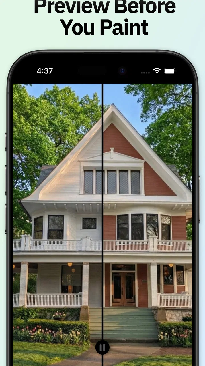
I downloaded Repaint House Paint Visualizer because choosing exterior or interior paint from a tiny color card is one of those home decisions that looks simple until you are standing in front of a wall with six nearly identical samples. In my first week, the app felt immediately useful: I could look at a room or the outside of a house and think through color directions before committing time, paint, and money. That quick visual feedback is the main reason I would recommend trying it.
What matters more, though, is whether an AI color preview remains useful after the initial novelty disappears. I spent time judging it as a practical house paint visualizer, not just as a fun way to recolor pictures. My conclusion is fairly positive, with an important qualification: it works best as an early decision-making tool. It can narrow down ideas and help people discuss options, but it should not be treated as a perfect representation of the finished paint job.
From first-week curiosity to a practical decorating habit
The app comes from Housepaint AI and sits in the House & Home category. Its purpose is focused rather than broad: previewing exterior and interior colors from major paint brands. That focus makes the first interaction easy to understand. I was not asked to learn a complicated design system or build a complete virtual renovation. The useful question is simply, “What might this wall or facade look like in another color?”
You May Also Like

 AccuWeather: Weather Radar
AccuWeather Review: A Quick, Clear Forecast for Everyday Decisions
For everyday plans, the best forecast is the one you can understand quickly. AccuWeather makes rain timing, radar, and local conditions easy to act on, with a few trade-offs.

 Hill Climb Racing
Why Hill Climb Racing Still Turns Crashes Into One More Run
A tiny car, a bumpy hill and one more upgrade: Hill Climb Racing keeps resurfacing because its simple chaos makes every near-miss feel personal.

 AliExpress - Shopping App
AliExpress Makes Global Shopping Feel Personal, but Shoppers Bear the Risk
AliExpress turns a global marketplace into a pocket-sized discovery engine. Its reach is useful, its shopping loop compelling, and its trade-offs easy to miss.

 Lords Mobile: Kingdom Wars
Lords Mobile Is a Kingdom-Building Routine, Not a Quick Match
A case-by-case verdict on the building, battles, device demands, and social commitments that make Lords Mobile rewarding for some players and exhausting for others.

 PDF Scanner app - TapScanner
TapScanner Makes Paperwork Easier to Capture, Check, and Share
TapScanner makes scanning with a phone feel less like a rescue operation and more like a dependable step in getting work done. Its capture tools are useful, though not flawless.

 Block Blast!
 Shows How Much a Puzzle Game Can Leave Out
A quiet grid game shows why puzzle players increasingly value instant clarity, repeatable skill and low-pressure play—and where the genre still needs to catch up.
More From Our News Desk
View All News


That simplicity is valuable when you are still exploring. Instead of buying several sample pots immediately, I can use a photograph to compare a warm neutral with a cooler gray, or imagine a stronger front-door color without painting over anything. The app turns a vague preference into something I can react to. I often find it easier to say that a color feels too cold or too heavy after seeing it on a real room than when looking at a flat swatch.
The AI approach is especially helpful for people who do not naturally visualize changes in space. A professional decorator may be comfortable translating a palette from a chart to a room, but many homeowners are not. In my experience, the visual preview lowers that mental barrier. It gives a starting point for conversation with a partner, family member, contractor, or even a skeptical friend.
There is also a useful emotional advantage. Repainting a house is disruptive, and exterior work can be expensive to redo. Seeing a possible result first makes the decision feel less irreversible. I would still order or inspect physical samples before buying paint, but I would rather use those samples to confirm two promising choices than test a dozen random colors.
How I would use it before buying paint
My preferred workflow is to take several clear photos before opening the visualizer. For an interior, I would photograph the wall straight on, include the floor and nearby trim, and take another image from the doorway. For an exterior, I would capture the whole facade in even daylight and then a closer view showing windows, roof materials, and permanent features. This gives me more useful context than relying on one dramatic angle.
I would then use the app to create a shortlist rather than chase a single perfect preview. A practical shortlist might include one safe option, one warmer alternative, and one bolder choice. Looking at those options side by side helps expose a common mistake: a color that looks attractive in isolation may compete with the roof, flooring, cabinets, or existing stonework.
One non-obvious benefit is that the process can reveal where a color decision is actually a lighting decision. If a room looks appealing in one photograph and disappointing in another, I would not immediately blame the paint choice. The difference may come from daylight, lamps, shadows, or the direction of the windows. That is a good reason to test the same idea against more than one photograph instead of trusting the most flattering image.
I also found it useful to separate “inspiration” from “confirmation.” The visualizer is strong at inspiration because it lets me explore quickly. Confirmation requires physical samples, preferably on the actual surface and in different lighting. The app helps me decide what to test; it does not remove the need to test it.
Where the AI preview is convincing, and where it is not
The most convincing results are the ones where the wall or facade is visually clear and the surrounding objects are easy to distinguish. A simple room with an unobstructed wall gives the color preview a cleaner job. Exterior images can also be helpful when the building has clear planes and the photograph is not dominated by trees, cars, deep shadows, or neighboring structures.
Complex spaces are more demanding. Furniture, artwork, curtains, railings, plants, reflections, and textured surfaces can make any automated recoloring less reliable. The result may still be useful as a direction, but I would be cautious about judging exact edges or subtle undertones from it. A preview can make a difficult surface look more uniform than it will be after real preparation and application.
This is the first important trade-off: speed versus precision. The app saves time during exploration, but the more unusual the room or building, the more I would treat the image as an approximation. That is not a reason to dismiss it. It simply defines the right job for the tool.
What remains valuable after the novelty fades
By the second month, I would not expect to open a paint visualizer every day. That is not a weakness by itself. Home renovation tools are naturally occasional-use products. Their lasting value comes from whether they remain dependable when a real decision appears, not from creating a daily habit.
For me, the recurring value is strongest during a sequence of related decisions. Someone moving into a new home might use it for the living room, hallway, bedrooms, and exterior trim over several weekends. A landlord preparing a property could use it to compare a restrained interior palette before arranging work. A homeowner planning gradual improvements could return whenever a new room reaches the decorating stage.
A realistic example would be a family preparing to repaint a small house. One person prefers a bright, clean exterior, while another worries that it will look stark. I would photograph the facade, preview a few light options, and then compare them with the roof and existing stone. For the interior, I would test a neutral in the main room and a slightly deeper tone in a hallway. The app would not settle the argument by itself, but it would make the discussion concrete and reduce the number of samples worth buying.
Another recurring use is checking consistency. When several rooms connect visually, it is easy to choose colors one at a time and end up with a disjointed result. I would keep the same general palette in mind while previewing each space, using the images to judge transitions around doorways and open-plan areas. This is more valuable than using the app only to find a dramatic accent wall.
The app can also support a slower renovation style. Instead of repainting everything in one weekend, I could explore the next room while living with the current one. That helps me notice how existing colors behave through the day. The visualizer gives me a quick preview, while real life supplies the longer observation that an image cannot provide.
Its current version is 1.0.13, and the app runs on Android 7.0 or later. That broad compatibility makes it accessible on older Android devices, which is useful for a home project because the phone used for taking photos does not need to be a recent flagship. The app is free to install, although in-app items range from $9.99 to $39.99 each. I would pay attention to how often I expect to use it before spending, since occasional users may get enough value from initial exploration while active renovation planners may find paid options easier to justify.
Who gets the most from repeated use
I think the strongest audience is homeowners who already have a shortlist of possible colors but struggle to imagine them in place. The app is also well suited to people who want a visual aid before speaking with a painter or designer. It gives those conversations a shared reference instead of relying entirely on names such as “soft beige” or “deep green,” which can mean different things to different people.
Renters may find it less useful if they cannot repaint, unless they are planning a future move or simply exploring ideas. Likewise, professional designers who already use advanced rendering tools may want more control than this focused app provides. I would not choose it as a replacement for a full design workflow involving exact plans, material schedules, and detailed lighting studies.
It is also not the right choice for someone who wants a guaranteed color match. Screens vary, photographs vary, and paint changes with surface condition and light. If the decision depends on a very subtle distinction between two similar shades, I would use the app to narrow the field and then rely on real samples.
The maintenance burden is small, but the decision process still needs discipline
There is little maintenance involved in keeping a visualizer useful compared with maintaining a full renovation project. I do not need to measure every wall before exploring a color, and I can return to the idea without repainting anything. The real burden is organizational: saving the right photographs, remembering which preview belongs to which room, and avoiding decisions based on an unusually bright or dark image.
I recommend taking photographs under ordinary conditions rather than staging everything to look perfect. A preview made from a heavily filtered image can encourage a color choice that feels disappointing in person. I would also keep the original image beside the recolored version. This makes it easier to notice whether the furniture, trim, and flooring still work with the proposed shade.
A second practical tip is to preview fixed elements separately in your thinking, even if the image shows them together. Roofs, tiles, countertops, windows, and flooring are not changing just because the wall is. A color that looks attractive against a blank digital surface may be a poor match for a permanent material. I find the app more reliable when I use it to ask, “Does this direction fit the whole space?” rather than, “Is this exact rendered color correct?”
There is also a maintenance issue for the final decision itself. Paint colors are often chosen under pressure, especially when a contractor is waiting. I would avoid making a final selection immediately after a long session of previews. The eye adapts, and after seeing many variations, almost anything can begin to look convincing. Taking a break and returning to the shortlist later is a simple way to reduce visual fatigue.
Where repeated use can become tiring
The biggest source of fatigue is not the basic idea; it is the temptation to keep searching. A visualizer makes experimentation inexpensive, so I can generate more possibilities than I can realistically evaluate. After a while, the process may stop clarifying the decision and start replacing it. I get better results when I set a limit on the number of serious candidates.
Another source of frustration is the gap between a smooth digital surface and a real painted one. Walls have texture, repairs, uneven absorption, and changing reflections. Exterior surfaces add weathering, masonry, landscaping, and shadows. The app can make the color conversation easier, but it cannot show every preparation issue that will affect the finished appearance.
Brand-based color exploration can create a different kind of overload. Having access to colors from major brands is convenient, but a large palette can encourage comparison without a clear purpose. I would begin with the mood and practical needs of the room, then use the app to test a manageable group. Starting with every possible shade is likely to produce indecision rather than confidence.
I also would not use the app as the only way to judge a bold color. Strong colors can look exciting in a single image and become tiring across a large facade or several connected rooms. For those choices, I would preview the idea, test a physical sample, and consider how much of the color I will see every day. The app helps me imagine the impact; it should not make the impact feel risk-free.
These limitations matter because they define whether the app earns lasting space. If I expect a precise architectural rendering, I will probably become disappointed. If I expect a fast visual filter for paint ideas, it remains useful whenever a repainting decision comes up.
How it compares with ordinary alternatives
The usual alternative is to visit a paint store, collect cards, and hold them against the wall. Physical swatches are essential for final checking because they show real material under real light, but they are less convenient for seeing a broad wall or an entire facade. The app wins at scale and speed; swatches win at physical truth.
Another alternative is asking a decorator or painter for a recommendation. Human advice is better when the decision involves surface preparation, architectural style, durability, or coordination with many materials. However, professional time can be limited, and a homeowner may want to explore privately before arranging a consultation. I see this app as a useful preparation step rather than a substitute for skilled advice.
Some people will simply use their phone’s photo editing tools. Those can be flexible, but they often require manual selection and may not be designed around paint colors from recognizable brands. Repaint House Paint Visualizer is more focused on the specific question of repainting a home. That focus is its advantage, provided the user accepts that an AI preview is a planning aid rather than a technical specification.
For a complete redesign, a dedicated interior design or architectural visualization service may be better. Those tools can offer more control over furniture, materials, layouts, and lighting. I would not choose them for a quick color check, though, because their extra complexity can slow down the simple decision this app handles well.
Cost, access, and who should skip it
The app is free to download, which makes trying the basic idea low-risk. Its age rating is Everyone, so it is presented as suitable for a broad audience. The presence of in-app purchases means I would inspect the available options before assuming every useful color exploration is included without charge. For a single-room experiment, I would start cautiously. For a multi-room renovation, I would compare the potential purchase with the cost of even one unnecessary paint sample or a wrong-color repaint.
I would skip it if I already know the exact color and only need a final physical check. In that situation, a real sample on the wall is more valuable. I would also skip it if my project depends on precise measurements, detailed construction planning, or realistic material rendering beyond paint. The app has a clear purpose, and it is better judged within that purpose.
On the other hand, I would recommend it to someone who keeps changing their mind because they cannot picture the result. It is particularly helpful before a store visit, before asking for quotes, or before discussing a renovation with someone who sees the space differently. The strongest benefit is not that it chooses for me; it helps me ask better questions.
My long-term verdict
After the first-week appeal fades, Repaint House Paint Visualizer still earns a place on my phone as an occasional planning tool. I would not call it a permanent daily habit, because repainting is not a daily task. Its recurring value comes from returning to it at the right moments: when comparing rooms, checking an exterior idea, preparing a shortlist, or trying to settle a disagreement before buying materials.
The app is at its best when I use it with restraint. I take honest photographs, test a few directions, compare the proposed color with permanent features, and confirm the finalists with physical samples. I do not expect the screen to reproduce every effect of texture, daylight, or paint finish. That workflow turns the AI from a novelty into a sensible first filter.
My final recommendation is therefore specific. If you want fast, visual help choosing among house-paint ideas, I think this app is worth trying, especially because it is free to start and has a strong average rating of 4.5 from around 203 ratings. It has reached over 10 thousand installs, which suggests that the concept is finding an audience without making it a replacement for professional design tools.
The lasting value is not perfect prediction; it is fewer blind decisions. Housepaint AI has made a focused app for the uncertain stage before painting begins. I would keep it for future color projects, but I would keep a paint card, a sample board, and my own eyes involved too. Used that way, it earns recurring space after the novelty fades.
FAQs for Repaint House Paint Visualizer
01What is Repaint House Paint Visualizer?
Repaint House Paint Visualizer is an innovative app designed to help users visualize paint colors on their walls before making a purchase. With augmented reality features, the app allows you to virtually paint your room, providing a realistic preview of how different shades will look in your space.
02How does the augmented reality feature work?
The augmented reality feature utilizes your device’s camera to overlay paint colors onto your walls in real-time. Simply point your camera at the wall you wish to paint, select a color from the app’s palette, and watch as the app displays the chosen color on your wall, accurately simulating lighting and texture.
03Is Repaint House Paint Visualizer free to use?
Repaint House Paint Visualizer offers a free version with basic features, allowing you to explore a limited color palette and use the AR feature. For access to premium colors and advanced tools, a subscription or one-time purchase might be required, providing additional customization options.
04Can I save and share my color visualizations?
Yes, the app allows you to save your color visualizations as images or projects. You can share these with friends, family, or contractors via social media or email, making it easy to gather opinions or show your ideas to professionals for further planning.
05What devices are compatible with the app?
Repaint House Paint Visualizer is available on both Android and iOS platforms. It supports most modern smartphones and tablets that have camera functionality. However, for the best experience, it’s recommended to use devices with the latest operating systems and AR capabilities.
Pros
- User-friendly interface for easy navigation.
- Wide variety of color palettes available.
- Real-time visualization of paint changes.
- High-quality
- realistic room previews.
- Supports multiple room types and styles.
Cons
- Limited free features without subscription.
- Occasional lag on older devices.
- Requires internet for full functionality.
- Ads can be intrusive in free version.
- Limited exterior visualization options.

Repaint House Paint Visualizer
Gallery